Tuesday, January 19, 2010

Heyah's analysis according to 4Ps

On the beginning I gave you some theoretical part about 4ps and brand strategy. Now I wanna achieve Heyah's analysis according to 4Ps.

1) Product- the polish mark of services of mobile telephony, acting in system prepaid. The operator of Heyah's net is Polish Digital Telephony, it to which belongs also Era net. It was really "fresh" brand for young people at the beginning.

2). Price- competitive prices (the lowest prices in polish mobile gsm networks); if you want know more about proces please click here: http://www.heyah.pl/english and choose option "Price List".

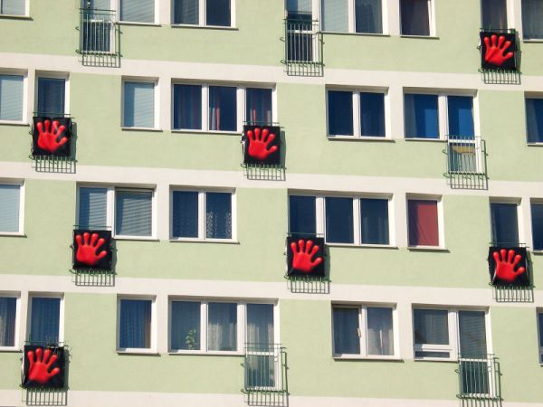
3). Place- the introduction of brand was really big success in polish gsm market in 2004. The logo was probably the most popular logos at that time. The characteristic logo is stylised on shape of pentadactylous palm, called Red Paw. The whole of identification of visual net bases on connection of colours black and red, sometimes completed with white background.

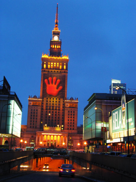
4). Promotion- the promotion campaign was very agressive. At the beginning the logo was in TV, on billbords, in newspapers and even at the streets. Than all the people were thinking what is that. Than after 2/3 weeks the company start with TV, radio and newspapers advertisements explaining what logo and brand is.

Heyah's campaigns advertising characterize with common changes of style. This kind of creation is dictated by aspiration to surprising consumers. Advertisements of Heyah were awarded in Poland and Europe many times.

On this website you can find all adverisements of Heyah:
http://www.heyah.pl/serwisy_reklamy

The essential element of formation of picture of mark is the interent Heyah's Club, uniting the users of net. The membership in Club connects with advantages - the reductions on products and services of Heyah net and the co-operating firms. Members of this Club can connect each other, creat bloggs and information in Vkleyah service.

Here is the link to Heyah Club: http://www.heyahklub.pl/hk/portal/?sn=HEYAH.PORTAL


Monday, January 18, 2010

Heyah embarks on a new cartoon campaign in 2009


In July 2009 Heyah started of a new cartoon campaign which is continued until now. The campaign introduced two cartoon characters: a smart cat,which name is Rysiek (Richie) and a bossy dog called Winston in a simple TV spot ends with a catchy tagline: No to sru [Here we go] which is a word-play on Polish mispronounciation of English word “through”.

This spot was extremely popular and has had over 500 000 views at YouTube which is a lot for a standard Polish TV commercial. The TV campaign was supported with outdoor and internet campaign. The internet part was focused on an interactive comic contest – there is a special website: http://www.notosru.pl/ where you can create your own comic.

A new TV spot followed promptly and showed how the smart cat handles two noisy ravens (in Polish “small raven” [kruczek], which refers to all kinds of hidden catches often employed by rival mobile networks in their promotions).
Strong outdoor campaign helped to get the message through. Polish cities were flooded with the billboards bearing the headline: We can’t stand the ravens (look the picture above, which mean free-of-charge text messages to Heyah and 0,29 PLN/min for phone-calls within Poland).

The next big campaign- Johnny 11 Fingers


The next big campaign of 2005 was focused on a fictional character called Johnny 11 Fingers. The main message and slogan of this campaign was: Be like Johnny 11 Fingers and check how it is when you always have 10% more.

The TV spot which was made to look like a documentary film told the story of a Polish pianist from Podlasie area who was born with 11 fingers. Johnny moved to the USA with just 2 dollars, but soon after his arrival in New York he was spotted by Miles Davis and had a big time American-style career under his nickname Johnny 11 Fingers.

The narrator in the spots is Wojciech Mann, a very popular Polish jurnalist and comedian who is known for his thorough knowledge of jazz and rock’n'roll music. The objective of this campaign was to promote Heyah Club, a loyalty programme, as members of this club always get 10% more to each topping of their account.

Heyah and its best early campaigns 2004-2005


The new brand used some premium locations to capture the media attention – e.g. the big red hand appeared also on The Palace of Culture in Warsaw, the most recognizable Soviet sky-scraper in the very center of the capital city.

The new slogan was: The pay-as-you-go alternative. The short and simple cartoon-like TV commercials were aired on TV and in cinemas. The new brand had a very distinctive visual style and used only red, black and white colors.

Heyah had the cheapest pay-as-you-go offer in Polish market and started the one-second billing, communicated only gross prices (at that time all competitors showed net prices in their advertising), clear and simple pricelist, and focused on the very low-priced text messages (called “SMS” in Polish) which were highly popular way of communication among Polish teenagers. The launch campaign turned out to be a huge success as Heyah managed to attract over 1 million users in the first months after its introduction to the market.

In 2005 Heyah had some of its best advertising campaigns to date in my opinion. I’ll discuss below my two favourites. In July 2005 Heyah caused some publicity with its TV spot created as an alternative version of the famous fairy-tale “The Little Red Riding Hood”. We don’t know how to tell fairy-tales was a slogan of this campaign and it again strengthened the transparency of Heyah’s offer. The shocking and drastic ending of the spot caught the attention of the State Council for TV & Radio (KRRiTV), a governmental organization that supervises TV and radio stations in Poland.

The Council claimed that the idyllic mood of the first part of the spot attracts children who are then strongly disturbed by the accident of the Little Red Riding Hood. Heyah was forced to withdraw this spot from TV stations as its broadcast was banned by the Council. A new version of the spot was aired later with black board and subtitles at the end.

Below I'm putting videos with the spots "The Little Red Riding" (first version and correct version).


Thursday, January 14, 2010

What is Heyah?

Now when we know what marketing means ans what is the brand and her strategy, I can start to analyse one of the famous polish brand, which is Heyah.

First of all I will explain what exactly Heyah is.

Heyah is a pay-as-you-go brand of PTC mobile network (or “prepaid brand” as we call it in Poland). PTC, which is partly owned by German T-Mobile, is currently the third biggest network in Poland and embraces three main brands: Era, Tak Tak (the first pay-as-you-go brand) and Heyah.

Heyah was launched back in February 2004 with a massive advertising campaign which still remains a category benchmark for a successful introduction. The campaign was created by agency called G7 and planned by Optimum Media OMD. Heyah was introduced by a teaser campaign which displayed only the extremely characteristic logo which is the red hand with a youthful graffiti-like typeface.

PTC’s strategy for launching the second pay-as-you-go brand was to create a very sharp image for this new brand and thus capture the very young target group which preferred the two rival pay-as-you-go brands: Polkomtel’s Simplus and Centertel’s Pop. After two weeks of teaser activities which involved mostly out-of-home media, ambient and internet, the new brand was officially introduced on March 13, 2004.

Under this link you can check and find some details about offers, which Heyah disposes:

http://www.heyah.pl/english

Wednesday, January 13, 2010

What we can say about brand strategy?


Definetelly building a brand is an on going challenge that requires The Company to emphasise its differences over so called competition. These differences are its brand values and they include amongst others product quality, product variety, sophistication, exclusivity etc. Emphasis of these KEY/CORE brand values gives The Company its personality and it is this personality that existing customers are reminded of and reassured by and that prospective customers are intrigued by, find association and comfort with. Association and comfort breed and engender strong relationships. These relationships are manifested in acceptance, purchase and loyalty. With continued brand support purchase is naturally followed by repeat purchase and so on.


We can distinguish 4 main components of brand. There are:

Identification


  • A Company’s brand values need to be identified. Without identification the process of relationship building can not begin. The Company’s brand values must be emphasised through advertising, not just key-moment tactical advertising but year round strategic advertising, press, poster, radio, web and so on.
Selection

  • Once identified from 'so called' competitors The Company’s brand can be readily selected by the consumer as an option easily understood. Free from competitive 'noise' The Company and all it represents will be clearly visible.

Communication

  • Once selection has taken place The Company can begin to communicate, now to a captive audience, everything from product and service detail, to the most important - the features and benefits of a positively engineered relationship.

Differentiation

  • This clear communication leads to The Company being differentiated from all others. Once differentiation has been established The Company’s brand personality becomes clear and relationships are both formed and strengthened.

A few words about brand image...

Now, when we know what marketing means we have to wonder what is the brand image, which is part of marketing, to understand whole movement of one of polish brand.

First of all it's worth to underlinie that brand image is not something you have or you don't! A brand is unlikely to have one brand image, but several, though one or two may predominate. The key in brand image research is to identify or develop the most powerful images and reinforce them through subsequent brand communications. The term "brand image" gained popularity as evidence began to grow that the feelings and images associated with a brand were powerful purchase influencers, though brand recognition, recall and brand identity.

It is based on the proposition that consumers buy not only a product (commodity), but also the image associations of the product, such as power, wealth, sophistication, and most importantly identification and association with other users of the brand. According to
Sigmund Freud, the ego and superego control to a large extent the image and personality that people would like others to have of them.

Good brand images are instantly evoked, are positive, and are almost always unique among competitive brands.

http://www.asiamarketresearch.com/glossary/brand-image.htm


Qualities that consumers associate with a specific brand, expressed in terms of human behavior and desires, but also related to price, quality, and situational use of the brand. For example: A brand such as Mercedes Benz will conjure up a strong public image because of its sensory and physical characteristics as well as its price. This image is not inherent in the brand name but is created through advertising.


If you want know more about brand image you can look at this website:


http://www.slideshare.net/air/brand-image